

I’ve decided that I’m opening an art gallery, but that art gallery is mostly hypothetical and exists as a newsletter on the Internet. Welcome, and thanks for coming.
—
The other day I was doing a deep dive on Ellsworth Kelly, and I was excited to find this excellent website about his career. I immediately told my husband about it, even showed it to him on my phone, to which he replied: “Yeah, I sent you this a few months ago.”
DOH.
All that to say, I recently discovered some serigraphs by Ellsworth Kelly that I’d never seen before.
So, this week at Gallery Blerf I thought we could stare at some really simple art or rather, art with very few elements that maybe seems simple on the surface but can actually feel quite complex.
We’ll call this week’s exhibit, NO YOU COULDN’T MAKE THAT in honor of your uncle who sometimes see modern art and says “I don’t get it. I could have made that myself.”
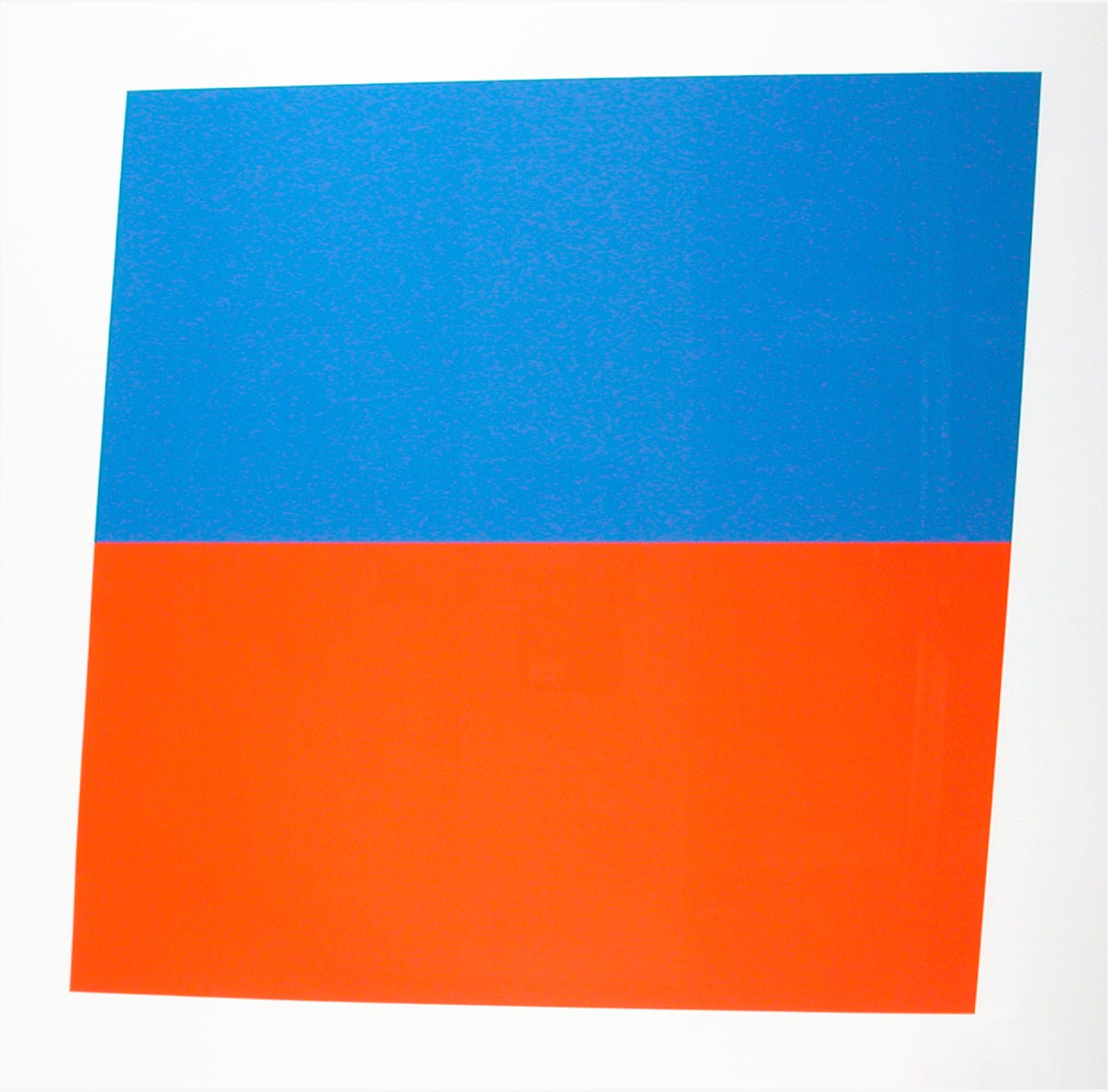
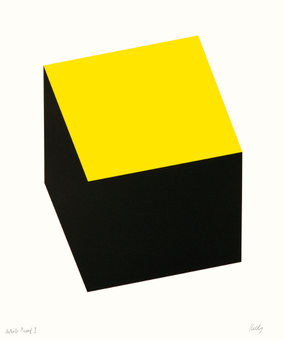
We’ll begin with two serigraphs Ellsworth Kelly, as mentioned previously.
There is something about Ellsworth Kelly’s art that makes me want to slow down and contemplate. It’s a weird thing, because this appears to just be two colored shapes. But the simplicity draws me in! Does it you?
And look at this one!
Could we have made this? I really don’t think so!
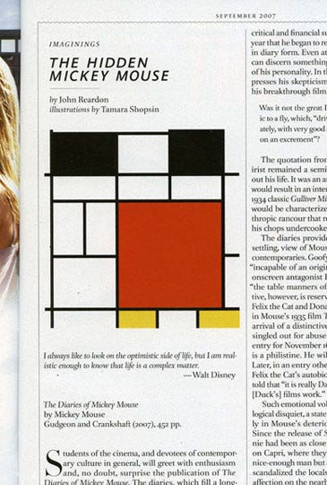
Our next piece is this illustration Tamara Shopsin made for an article titled The Hidden Mickey Mouse.
Tamara Shopsin is one of my favorite illustrators because she can invoke multiple ideas with very few shapes and colors. If you think about it, that’s maybe witchcraft.
More of her illustration work here.
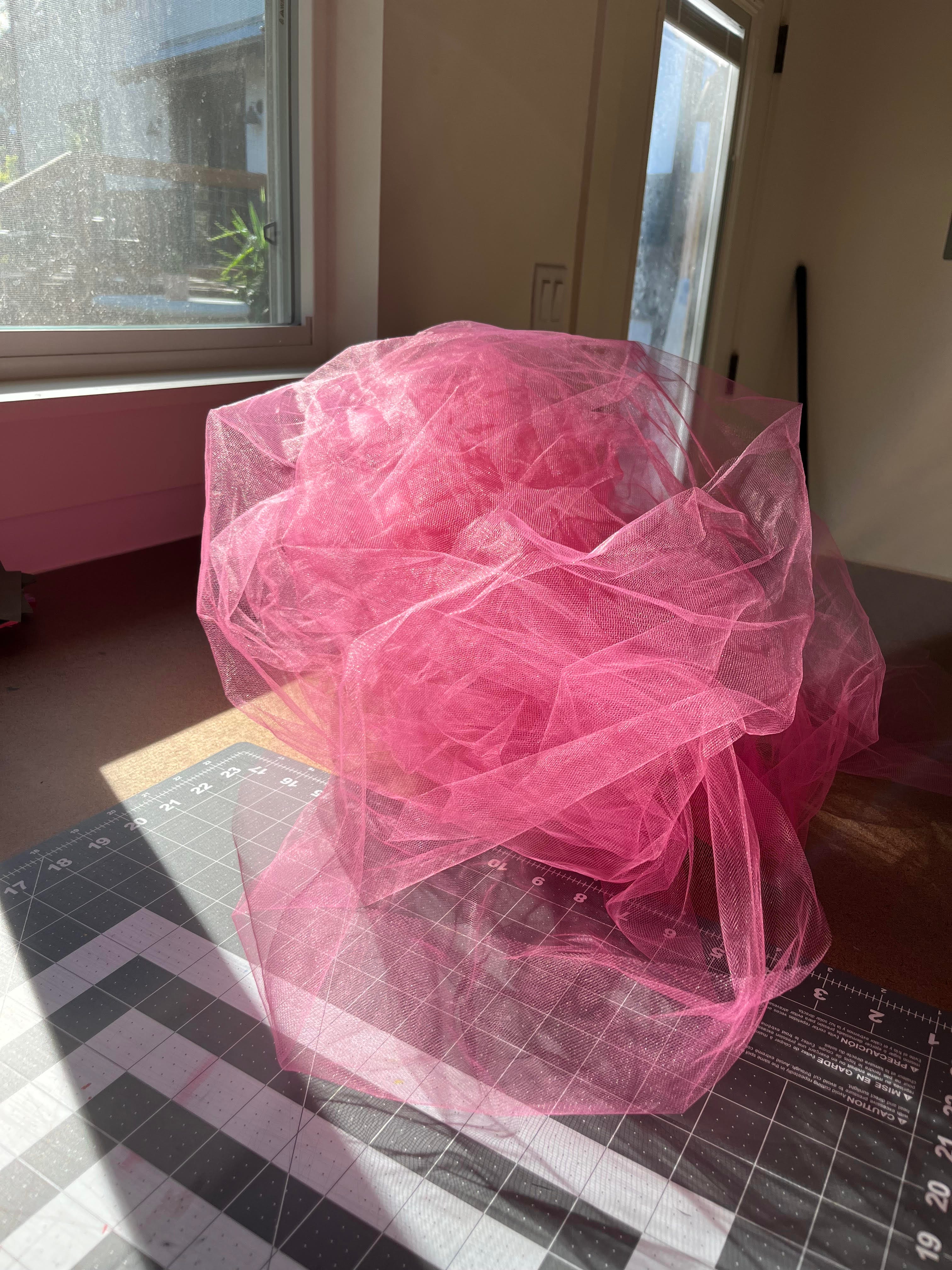
Our final piece is this ball of bright pink tulle sitting on my studio desk. I pulled this out months ago to work on a project and have since left it out, because…look at it! I’ve enjoyed examining it as the light changes throughout the day.
__
That’s it!
Thanks for attending another Gallery Blerf exhibit. Are you a person who likes deceptively simple art? Or is this not your deal? I’d love to hear.
Gallery Bookstore
Ellsworth Kelly: Postcards: a collection of EK’s fascinating, sometimes humorous, always interesting postcard collages.
Le Bon Shoppe socks: some minimal art for your feet. My current favorite pair is this one in a perfect shade of red.
Interaction of Color: Josef Albers’ book on color theory. It reads a bit like a textbook and can feel technical but if you consider yourself anywhere in the realm of “nerdy” about art, you’ll enjoy it.
Color as Field: American Painting, 1950-1975: my friend Cristina recommends this book and she has the best taste. Also—if you’re somehow not familiar with Cristina’s Internet-famous interior design quiz…grab yourself a delicious beverage and go enjoy! (I am a mix of pottery studio and museum bookstore…which is how I got the idea for the name of this section!)
Related Internet Treat
Ethan Cook would have fit right into this exhibit (and about 100 other artists!). I love this home tour of his—it’s chock full of great art.
I wish you many visual treats this week, and perhaps a plate of hot mozzarella sticks. LMK if you see any great “simple” art out in the wild!
Adios,
Rachel
I liked the last photo so much that I looked up the site. So neat! I love colour in a kaleidoscope.